June 16, 2010

Don't Be Afraid...


I love this page from Issue #3 of Nesting Newbies magazine.  
Great kitchen, great light fixture, and great advice.  

June 11, 2010

Nursery Color Board

Our friends are buying a house AND having a baby girl (congrats you two!). They've asked for some suggestions for the nursery, according to these guidelines:

1.  The crib, dresser, and changing table are black.
2.  They're moving a red bookcase into the room.
3.  They don't want too much pink.
4.  They're not into "the typical teddy bear borders and stuff like that".
5.  They want modern with a bit of traditional, to keep it comfortable.
6.  They want to incorporate a music theme.

Below are my thoughts regarding color schemes and patterns, to give us some direction.  (Click on any collage to view it larger.)  This first collage shows ideas to incorporate SOME pink without making it the main color. Pink and red can work together well, especially if cooler colors like light blue and pale green are used with them to tone down the look. I think the light blue or pale green would look great on the walls, accented by the pink and red in fabric and accessories.


Collage info, clockwise from left to right (ending in center):
1.  etsy baby blanket
2.  from Young House Love
3.  quilt from etsy
4.  etsy apples & pears crib sheet (I believe this fabric is available at Jo-Ann Fabrics)
5.  Amy Butler Fabric swatch (not sure what it's called)
6.  Bella Baby Quilt from etsy
Center:  from Young House Love

This next collage shows ideas for eliminating the pink altogether, yet still tying in the red from the bookcase. In this case, I still think the pale green walls would look great, or you could also look at a soft yellow.  Or, if you wanted it to look less cutesy and more modern you can just use white or light gray walls. I love the middle color swatch of Pear Green, Chili Pepper Red, and Peacock Blue from Benjamin Moore (Pear Green for walls). But I also love the Amy Butler fabric swatches and crib skirt design at the bottom that use only robin's egg blue, red, and white.


Collage info, clockwise from left to right (ending in center):
1.  Molly baby quilt from etsy (I LOVE this quilt!)
3.  Moda-frolic quilt from etsy
4.  image unknown
6.  Nursery from Young House Love (shown for wall color and frame gallery wall)
Center:  Color Palette from Design-Crisis

This next collage puts together some miscellaneous concepts. When it comes to the music theme, I suggest keeping it relatively simple. Rather than wall decals, I might recommend using frames for album covers, music posters, sheet music, or a collage of concert ticket stubs. And I KNOW you guys have a great graphic designer in the family who could do something wonderful that's music-related and worth framing, and will be much more meaningful. You could even just print out album covers in black and white and frame them in colorful frames. One of the images below also shows a vintage record player, which I think is a great touch.


Collage info, clockwise from left to right:
1.  from Design-Crisis (album frame idea)
2.  from Little Green Notebook (playful nursery design scheme with red)
3.  nursery from 6th Street Design School (frame gallery wall, vintage record player)
4.  source unknown (album wall)
5.  from Sprout Gallery (crisp and fun red, blue, green color scheme with white backdrop)

June 10, 2010

It's About Time


Once in a while I get the urge to post about specific products.  This has nothing to do with sponsorship or anything of that nature (after all, I only have 16 followers so I'm not high on anybody's sponsorship list!).  I post about these products because I like what I see, and I like the design behind it.  

So today I'm posting about a new tub from Kohler, the Expanse bath.  You know the bowed shower curtain rods that were a big trend because everyone wanted more elbow room in their bath tub?  The idea was great, though often awkward because the shower curtain still had to drape inside a rectangular tub to prevent puddles of water on the floor.   

The concept seems so simple, yet it's taken this long for someone to finally come up with a bath tub that follows that same train of thought.  Kohler's tub fits in a standard 5' bath alcove (assuming this standard will accommodate a 32" wide tub rather than the older style 30" tubs).  There are so many times I've been limited by the size of the existing alcove, and this offers another option for people who like to soak.  Finally!


The only limitation?  I've yet to see a curved glass shower door, so you're stuck with a shower curtain for now.


And to top it all off, for those of you who love baths, they've also introduced a closing overflow drain.  If you're in the business, you may know the little trick many of us have used to allow clients to have a deeper bath... installing the overflow upside down to allow for a couple more inches of water in the tub.  The drain gives you the option to close the overflow when bathing so you can fill the tub as high as you want!  Probably not recommended for kids' baths... 

June 6, 2010

New Artesio Kitchen from Poggenpohl


I think my favorite thing about Poggenpohl is their ingenuity.  They are always looking for new ways to define the kitchen and integrate it into the home.  The new Artesio kitchen, designed by Hadi Teherani, carries it one step further.  This kitchen, in usual Poggenpohl form, goes beyond just the cabinetry, and that's what I love.  The look obviously won't work for many of our homes (though I bet it would if we did have a home like those shown on their site - tall ceilings, open plans, and tons of windows!)


Notice the big box-like structure that forms an arch connecting parts of the kitchen?  This is more than just architectural.  It's the power management area, which includes lighting, electrical, and audio system options.  It also contains the display area glassed in on 3 sides with LED lighting on top.  There are various bottom inserts available for this display area so it can serve many different purposes, whether storage or display.


The wall systems are integrated with the cabinetry.  Another thing Poggenpohl really does well that we kitchen designers should pay attention to is their use of the backsplash area.  Rarely do you just see decorative tile - Poggenpohl recognizes the potential use of that wall and offers accessories like shelving and other organizational systems, all built-in and flexible as a part of the kitchen.  Note the horizontal stainless steel accent strip that also serves as a power strip and mounting plate for wall-mount faucets.


The design carries through to the dining furniture and beyond, again focusing on the integral role the kitchen plays in the home.

I think I like the ideas here more than the actual kitchen (though the kitchen itself is beautiful too). The idea of integrating the kitchen, so the line between cabinetry and everything else becomes blurred, is a great concept.  And adding decorative/architectural details for practical purposes like power, storage, and lighting is ingenious.

June 4, 2010

Chalkboard Paint


I know, the whole chalkboard paint craze is sorta overdone.  I'm definitely not the first person to paint a wall with chalkboard paint.  But it's so fun, and sometimes fun just has to overrule fashion when it comes to design.


We wanted to add a little character to the wall in our kitchen, next to the laundry closet (which you'll notice still needs doors).  I'm honestly usually not a big fan of accent walls, but in this case, this one vertical black stripe did amazing things to the look of our kitchen.  The already-tall ceilings seem even taller.  I love it.


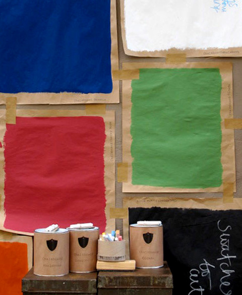
So I will continue to love this trend of chalkboard paint.  Especially now that it's available in fun new colors from places like Murobond:


June 3, 2010

More Fun with Spray Paint


I wanted to add a little whimsy to our dining room, so I bought a table on KSL's classified ads and we spray-painted it with Valspar Glossy Mediterranean spray paint from Lowe's.  

Here's what it used to look like: 


Boring, right?  It's amazing what a little spray paint can do.