April 29, 2010

Park City Kitchen


I thought I might share a project in Park City that I recently completed through Arendal Kitchen Design.  The cabinetry is stainless steel and maple, which, combined with the natural elements of the stone, granite, and rustic wood floors, create a great "mountain modern" look. 

The cabinetry is from Wood-Mode.  The custom stainless steel floating shelves and island accents were a fun challenge.  The shelves needed a strong hidden bracing so they'd be able to support the weight of heavy pots and pans, and they also needed to be able to accommodate the built-in task lighting.  I worked with Ray Bird and Kingdon Sheet Metal to get all the components just right, and our installers made it all fit together perfectly.  Scandia 360 was the general contractor. 


April 26, 2010

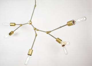
Our "new" kitchen light

Sometimes hand-me-downs are a blessing, even if they're a little worn...


Now I'm not so sure about the bulb... we've got a standard bulb in there now, but do you think I should switch it up for a different shape?  Thoughts?

April 22, 2010

Free Downloadable Printable Art!

I just discovered Feed Your Soul: The Free Art Project.  Check it out here.  They feature free art that you can download and print for your own personal use.  What a great (and inexpensive) way to add some color to your space!  Many of these are great for nurseries (see previous post), which is where I stumbled upon this site (thanks to goodfoodgoodfriendsgoodlife).

Here are a few examples of some of my favorite images:


April 21, 2010

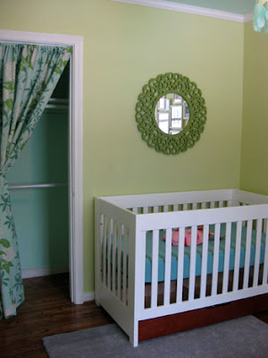
Nursery Inspiration Photos

Before any of you get all crazy, this post is NOT for my own nursery - it's for my friend Rebecca.  Though after going through all of these photos, I have to confess that I'm excited for the day when I might get to design my own nursery (and fortunately I've still got a LOOOOONG time to think about it)!


from 86'n it


source unknown (sorry!)

source unknown (sorry!)


from hashai


Repeated elements within these photos (and elsewhere) that I LOVE:  yellow cribs, handmade mobiles, cutesy chandeliers.

Have fun with this Rebecca.  I can't wait to see what you end up doing!

April 20, 2010

Kim's Bathroom Makeover

I just saw this post on Desire to Inspire (one of my top 5 favorite blogs), and I had to repost it here.  Here's an example of what paint, accessories, and a little creativity can accomplish.  It's quick, relatively easy, and inexpensive.  And it looks great.

Here's her bathroom before:  standard, dated, and boring.... blah


Here's her bathroom now:


She added a basic chair rail, painted, and replaced the faucet, light fixutre, and accessories.  She also installed a peel & stick floor on top of the old vinyl.  She painted the cabinet and added a curtain in place of the 80's style laminate doors.  It looks HOT (helped by the awesome yellow Eames fiberglass shell chair!)

This isn't a long-term solution (I would never suggest peel & stick flooring in a bathroom for any period of time), but it definitely makes a huge difference.  Don't you agree?

You can read the entire post (with more photos) here.

April 19, 2010

Mola Art

We also received a few framed pieces of mola fabric art from Mike's grandmother.   "The mola originated with the tradition of Kuna women painting their bodies with geometrical designs, using available natural colours; in later years these same designs were woven in cotton, and later still, sewn using cloth bought from the European settlers of Panama." (from Wikipedia) 

Several layers of fabric are sewn together, and then the designs are cut out from the top layers to expose the different layers beneath.  It's obviously a very detailed and time-consuming process.  The more colors (i.e. layers) the greater the level of difficulty. 

The molas are now hanging in our entryway and I love the burst of color they add!


These pieces are beautiful, especially when you look closely and appreciate the fine details.


For more information, see Wikipedia.

April 16, 2010

Feng Shui - It's Still Around?

So I went to a seminar a couple days ago titled "Green Chi".  Essentially, it was about integrating Feng Shui and green concepts into your design.  I was hesitant at first.  "Feng Shui" and "Green" are probably 2 of the most over-marketed terms of the last decade, and the thought of them being combined was just a little scary. 

The seminar was hosted by Linda Lenore, who is legit as a Feng Shui Master (studied around the world under 18 masters, and became a master herself in a ceremony in the Canary Islands). 

There were a lot of terms and concepts thrown at us, from various schools of Feng Shui.  I'm not necessarily sold on it (though not completely against it either), but here's the cool thing about the whole seminar:  The idea of feng shui and green design really just comes down to the purpose of design in general:  It's about using your surroundings to make you feel better physically, mentally, spiritually, and emotionally.  And that's what design is all about. 

A quote she used from Winston Churchill:  "We shape our buildings; thereafter they shape us."  Love it.

So it's about common sense, and making people feel good.  The end. 

That being said, I couldn't help thinking about some of her points and how they apply to our home.


According to her Feng Shui guidelines, the front of our house is attracting tons of good energy.  For these reasons (please note I'm paraphrasing, or dumbing it down for my own sake):

1.  Its position.  It sits slightly uphill - this spot is referred to as  the "seat".  This means there's a back to the seat, which is typically a mountain, though in our case our back neighbor's house at a higher elevation, and eventually the foothills as you go even further back.  There are chair "arms" to the left and right, which are ideally  mountains or hills but can also be neighbors' houses in more urban locations.  The back and arms protect the house.  And the lower elevation at street level is the "water", so sitting slightly raised protects us from  flooding.

2.  It's red.  Red and yellow colors attract energy.  This is one reason why painting a door red is a big deal.  Though in my opinion, red doors just look good.

3.  The plants and their aromas attract good energy.  (We just transplated our lilac bush to the front yard because our dog kept digging it up, so hopefully we'll soon have even more good energy coming our way!)

4.  The path to the front door is a winding path.  Apparently a straight path pushes the energy too fast and that's not good.

So we've supposedly got this abundance of good energy being attracted to our house.  The problem is, I'm pretty sure it immediately leaves once it gets past the front door...

April 12, 2010

DIY Light Fixtures

For a while we were considering making our own light fixture to hang over the eating area in our kitchen.  We did a lot of research online and I was amazed at how many cool DIY ideas are out there.  Here are some of my favorites (click links for instructions and more info): 


from Instructables
(If you haven't seen Instructables before, you should check it out right now.  There are some really smart people out there coming up with crazy ways to do things!)


another one from Instructables

(Also see The Brick House's version here)


designed by John Giacomazzi, via remodelista

We just acquired a couple great vintage fixtures so we may no longer need to make our own (depending on whether we can find a replacement for a missing glass globe), but I'm still intrigued by the idea.  Anyone else have any good DIY fixture ideas?  I'd love to hear about it!

April 9, 2010

Grasshopper!

We are very fortunate to have just acquired this original Saarinen Grasshopper chair from Mike's super-stylish grandmother (thank you thank you thank you!).  This chair has a lot of sentimental value and it's really comfortable... plus it just looks HOT.  I love it!


The upholstery is the original fabric, but needs to be redone. We're not sure what color the new uphosltery will be, but the current orange / green / yellow color scheme we suddenly have in our Living Room just can't last. And if any of you are wondering, this is not a project for my upholstery class... we're bringing in the experts for this one!

A little history for any other chair geeks out there... The grasshopper chair was designed by Eero Saarinen for Knoll. It was Saarinen's first chair designed for Knoll, and produced from 1946 - 1965. Modernica is now making the chairs according to Saarinen's original specifications, though in hundreds of color and finish combinations.

Other more well-known Saarinen designs:

Tulip Table and Chairs
image via Mason, Inc.

Womb Chair