May 28, 2010

Colorful Eclectic Kitchens


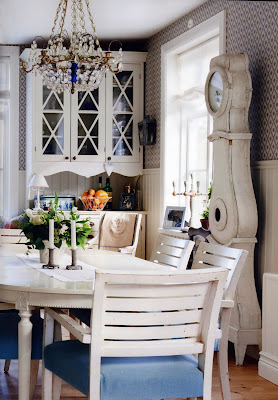
So I love personality in a kitchen, and I love kitchens that don't look like everybody else's kitchen.   I love eclectic kitchens - kitchens that "mix it up a bit" with multiple styles and finishes and colors.  And I love kitchens that tell a story (as Paul Anater over at Kitchen and Residential Design put it this week in his posts about kitchen story boards).  I love the use of unique furniture pieces, or art work, or dramatic color... anything that makes it different.

It's funny... my tastes in general tend to be more simple and modern, but there is something warm and comfortable about an eclectic kitchen with a little color and maybe even a bit of country to it.  It makes me want to meet the owner and listen to the story of their kitchen, directly from them.


source unknown


On a more formal note, this kitchen by Mick DeGuilio for SieMatic gets my vote for Kitchen of the Year.  It's simpler and more modern than anything I've posted above.  It's more elegant... yet still cozy.  It's timeless, and far from sterile (which is a problem with many modern kitchens).  I would feel completely comfortable sitting in one of those chairs, or even chopping veggies on that countertop.  This kitchen has a wonderful yet subtle mix of style and color.  And it has tons of personality.  I'll have to do an individual post on this kitchen another time because every detail is beautiful, but I wanted to include it in this group because it's just as different as any of the louder kitchens shown above, just in a quieter (and less country) way.

May 26, 2010

What Do You Think Of This Door?


This is a new finish treatment from one of our cabinet manufacturers, a local company named Hallmark Cabinets. When I first saw a small finish sample, I wasn't really impressed. But we just got a larger door sample last week, and I love it. The technique is a wire-brush technique. Just like it sounds, they run each piece of the frame through a machine that uses a wire brush to texture the top part of the wood or veneer, and then they finish the door in whatever stain, paint, or glaze is specified. The resulting product is very dramatic due to the added texture and the way the light is reflected from the surface.


My only concern? How difficult will it be to clean all those tiny grooves? Maybe I should only focus on selling this to people with housekeepers.

May 25, 2010

Backyard Progress


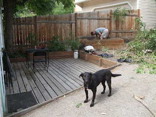
Our backyard is slowly starting to take shape.  We've still got a lot of work ahead of us, but at least we can now sit on the deck and enjoy a meal or morning coffee without getting overly distracted by every remaining item on our to-do list.

When we first moved in, the deck area looked like this:

And our old potting containers looked like this:

And now, after a lot of weeding and planting and pruning and spray-painting, (not to mention a lot of bargain shopping at places like ReStore, consignment shops, World Market, Big Lots, Ikea, and KSL classifieds) it looks like this:


And it will look even better once the plants fill out and the flowers bloom!

May 21, 2010

Heath Ceramics Dimensional Tile


by J. Weiss Design

Check out this beautiful tile from Heath Ceramics. Their Dimensional series includes the oval and crease patterns, both of which are simple and modern with a retro twist. A client of mine is possibly using these patterns in her kitchen and bathrooms, which I think will look incredible. Yes, the tiles behind the range will likely collect grease, but at least the glossy smooth surfaces will be easy to wipe down.  And I think the look is worth a little bit of extra cleaning, don't you? 


by J. Weiss Design


from Heath Ceramics

Below is the Crease tile.  Unfortunately it's the only image I could find of the tile installed.  

May 20, 2010

Offices in Closets & Small Spaces

from Paula Prass (love her colorful blog!)

A friend of mine lives in a great but tiny apartment with an incredible view of the city (if you call Salt Lake a city).  She's considering turning a closet off the main living area into an office.  I've seen some great office-to-closet conversions so I was excited for the chance to do a post for her.

A common theme in all these photos is the use of wall space.  Whether it's shelves, fabric-covered bulletin boards, colorful clipboards, or peg board, don't forget how useful walls can be in areas where you don't have a lot of room for desktop space.

These old filing cabinets were given new life with spray paint.
source unknown (sorry anonymous lady with super fun office!)

Organization is key, and cardboard storage boxes can be a very inexpensive way to get organized.

from flickr

I love the bulletin boards here, and the stacked drawer units.
from flickr

A simpler desk space.  The black & white look great, though there's not a lot of "hiding" space here.

The pegboard and floating shelves are functional, and I love the wallpaper on the back wall.

from Country Living via The Inspired Room

This photo isn't great, but I like the candy jars!

from cnn.com

Another example of the of organizing with cardboard magazine boxes, which minimize clutter by hiding the various colors of magazine stacks.

from cnn.com

More beneficial bulletin boards and peg boards.  The mirror is interesting too, though I'm not sold on it yet.  I guess it probably gives that illusion of more space, but I'm hesitant to use mirrors in areas where it can also give the illusion of more clutter.


I love the clipboards and color here (had this image saved specifically for my own office).  I'm guessing you can use wallpaper, fabric, or maybe scrapbooking paper to cover boring old clipboards.

source unknown

The picture ledges (I assume from Ikea) also make great ledges for office accessories.  I love the chalkboard paint here too.

source unknown

I like the use of these canisters (or mailing tubes?) and an old shutter with binder clips for mail organization.

source unknown

For slightly larger spaces, the Ikea Expedit units are a great (and inexpensive) way to keep things organized.
                          

Jen, I hope you're inspired.  Let me know when the project starts - I want to help!

May 18, 2010

Someday...

Someday this... 


Will hopefully look like these... 
photograph by Stuart McIntyre, via desiretoinspire


from flickr

It's going to be a challenge, but aren't these PK-22 chairs by Poul Kjaerholm beautiful?  


May 13, 2010

The Difference a Bulb Makes


A few weeks ago I posted about the "new" light fixture we inherited.  I used the photos of the standard white light bulb, which was there because it was the only extra bulb we had.  Well, we finally changed the bulb to something more fitting - a simple clear globe.  Obviously the fixture looks better, but what really surprised me was the sudden dramatic lighting effect created with the clear vs. white frosted glass.  Our Kitchen has become a disco.  Not really, but the lighting effect is pretty amazing.  So for everyone who suggested the clear globe bulbs, here's a pic for you.  Please ignore the frayed black cord (which will someday be replaced) and the horrific mini-blinds (which should probably be higher on our priority list than they are).

May 12, 2010

Inspiration: White / Walnut Kitchens


by Audrey Matlock via Desire to Inspire

I love the contrast of stark white with a warm wood like walnut in modern kitchens. I keep hoping for a client that wants this look, and yesterday I may have met that client... fingers crossed!


from Eurocucina via Contemporist


by Joel Sanders via Desire to Inspire


May 10, 2010

Deal of the Day


This rug is only $ 4.99 at the World Market in Park City (and I assume other locations too). I'm not sure where I'll put it, but who can resist a 5-dollar rug?  Available in a couple other colors.  Approximately 2'x3'.

May 9, 2010

Upholstered Dining Chairs

by Emma Jane Pilkington via Little Green Notebook

My good friend Nedra is looking to reupholster a set of dining chairs and she's torn between a neutral fabric or something more bold with color and pattern.  I've offered to post some photos depicting various fabric prints to see if anything inspires her.  Here are some fabric looks that I love and think could work really well in her setting.  And the great thing is, if you don't want to commit to bold color, you can still use a bold pattern in a more neutral tone and get a very sophisticated look.

1)  Trellis Patterns.  Kelly Wearstler's Imperial Trellis fabric for Schumacher is a huge hit right now.  I love the look of that as well as some of similar trellis patterns.

by Brown Design, Inc. via decorpad  (I LOVE this space!)


via designlinesltd  (love the yellow accents!)

2)  Large Floral & Abstract Floral Prints. 


by Little Green Notebook, using the oh-so-popular Chiang Mai Dragon fabric

Thomas Paul design for Duralee


Thomas Paul design for Duralee
3)  Chevron pattern.

from 1st Dibs via Caitlin Creer

And one more thing... I've seen that indoor/outdoor fabrics, which are more comfortable and stylish than ever, are being used more and more in interior spaces, which might make sense for a dining room used by kids.  Otherwise just make sure whatever you choose is durable and has some sort of stain treatment.  Here is a great post from Spruce Austin about fabric durability.

Have fun Nedra!