Showing posts with label white kitchens. Show all posts

June 13, 2016

Eclectic Bungalow Kitchen


There's a saying:  "Don't mix business with pleasure."  But I disagree.  As long as you stay professional and set expectations in advance, it can be a very positive experience.  Case in point: These clients are good friends of mine.  Because of this, I've gotten to see them REALLY use and enjoy their kitchen, and I've experienced first-hand the impact it has on their family and their everyday life. Also, since we are friends and have some similar tastes, it was extra fun to work with them!

We removed a wall, shifted the layout, and upgraded everything.  What a difference!


Because the kitchen expanded into the dining room, we pushed the dining space to the corner, with a great built-in bench.  We were invited for dinner and easily fit 4 adults and 3 kids with room to spare. (Custom seat cushion and extra dining chairs are on order - will update post with new pics.)


The great thing about white kitchens is that you essentially have a blank canvas, and then you add personality and style through the tile, hardware, lighting, etc.  In this case, there are 2 major showstoppers:  


1)  Backsplash:  The client loved look of Heath Ceramics, and they also loved the company and had previous experience with their products.  This backsplash tile is a work of art! 


2)  Reclaimed Wood:  We wanted a warm eclectic look so we were exploring various reclaimed wood options on the peninsula.  This mix of 3 different colors from Stikwood was the perfect solution!

And to really truly show the transformation, here are some before photos:


And a rendering we did of the proposed space during the design phase:
Props to Justin Bates Construction for making it real!


May 2, 2014

Stunning White Kitchen Remodel - Before & After


Last week I wrote about a recent kitchen remodel over on the Utah Style blog.  Today I wanted to present some before & after photos for comparison.

The "before" photos of a remodeling project are what makes remodeling so unique compared to new construction.  They indicate the challenges involved in the job, as well as the dramatic difference good design can make, both in aesthetic and (just as important) function.

Let me give a little background on this project.  The client was looking to update their oak kitchen so she called enzy design.  During the course of our initial consultation I pointed out some of the inefficiencies of the kitchen layout, and we discussed potential changes.  We explored these changes throughout the design phase - I presented a concept that combined the island and dining table, creating space for a casual sitting area in the kitchen.  Fortunately the client was open to new ideas, and we went in this direction.  Since photos speak louder than words, I'll stop writing and just post some photos:

Before:
 

After:

Before:

After:


Before:

After:

Before:

After:

Before:

After:


April 15, 2013

A Luxurious White Kitchen I Just Have to Share


While browsing around facebook over my morning cup of coffee, I stumbled upon this kitchen, newly installed in a showroom in Ireland.  The showroom is O'Conners of Drumleck, and I'm now a fan.

I just had to share a couple of the images, and I think you'll see why I had to post:


I love the lines of the island, and the furniture look of the island & china cabinet.  I also love the ceiling feature over the island, with plenty of task lighting and the inconspicuous yet strong recessed ventilation.


The interiors of the cabinets are stunning, with walnut shelving, drawer labels, and surprising marble & mirror surfaces.


The curved corner cabinet adds a luxury look, as does the full-height backsplash.


See more of their beautiful work on their website and their facebook page.

August 3, 2012

Kitchens & Brass


I'm giggling to myself about this title because I used to work at a tiny little kitchen design studio for about a year during college - I had forgotten about it until I decided to do a post about brass hardware in kitchens, as this place was called Kitchens & Brass.  So, in homage to that short time in that little studio, I've titled this post "Kitchens & Brass."

Anyway, it's taken me a while to warm up to the resurgence of brass, but now that I've seen it in modern settings, I'm loving it.  Brass is back, but in a VERY different way... with subtler tones and sleek modern lines.  I stumbled across the above photo while flipping through my dwell magazine the other day, I can't get enough of it.  Brass with white and natural wood... the brass warms up this kitchen in a way that polished chrome or stainless steel couldn't do.  And it adds a little touch of formality, but in a non-stuffy way.

A few more examples of brass in modern(ish) kitchens:
from cococozy


A common element, and what makes it all work, is the whites and grays in these spaces.  Come to think of it, I may have just the client for this combination... 

What do you all think?

March 29, 2011

More Photos: White Kitchen Remodel

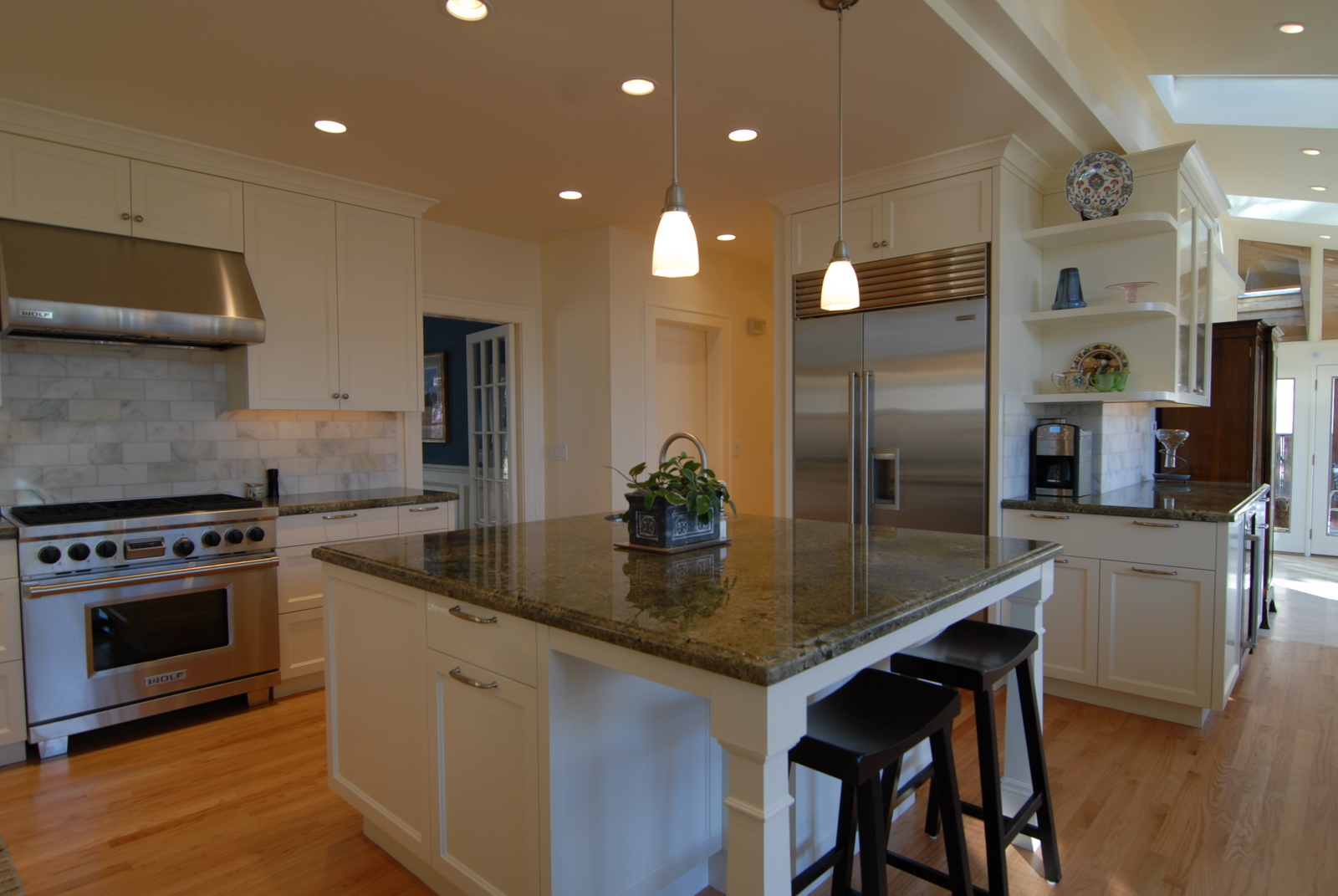
Last week I showed you all some before & after photos of a recent project I designed.  Now that you've all got a sense of the significant layout changes involved in this design, I thought I'd post more of the after photos and details.


the Lemans corner system (see it in action here).  I love this thing!

pull-out spice rack

roll-out pantry shelves

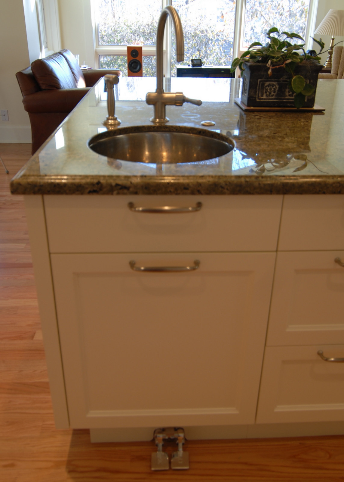
faucet operated by foot-pedals (my client is a surgeon and wants to keep everything sanitary!)

Sometimes you need to custom-design an entire cabinet for very specific pieces.  Everything needs to have its place, right?

March 23, 2011

Before & After: White Kitchen Remodel


I'm really proud of the outcome of this kitchen remodel.  It's beautiful and bright and just plain happy.  But you don't get the full sense of this space until you see before photos and realize the major layout changes that made this kitchen what it is.

The large opening shown above used to be this brick wall:

The powder room (the closed white door to the left) used to be straight off the kitchen, directly across from the refrigerator: 

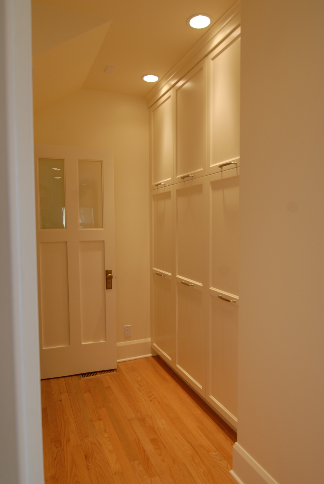
Now the powder room (still in the same location) is in a corridor just off the kitchen:

The doorway location from the dining room (to the right in the photo) prevented any deep base cabinets, and therefore the space by the window wasn't very functional: 

Now the doorway has been relocated to the right side of that wall, allowing for a working kitchen uninterrupted by traffic flow:

Quite a difference, huh?  Not to mention the layout aspects you can't see - how we made sure each cabinet was as functional as possible, so everything had it's place.  More after photos to come in another post...

Architect:  Tom Buese
Contractor:  Sam Sampinos 


January 21, 2011

Another Beautiful White Kitchen

I recently subscribed to House Beautiful and got my first issue this week.  I've been drooling over all of the photos and recipes, but this one most of all:


This kitchen is in a Manhattan residence designed by architect Alexander Gorlin and interior designer Garrow Kedigian (photograph by Pieter Estersohn).  It has the classic and oh-so-trendy elements of white cabinets with Calacatta Gold marble countertops, but the design of the cabinet doors is completely unique (inspired by the grids in the windows).  The cabinet doors tie in really well with the geometric designs on the 18th-century Chinese bamboo chairs as well as the Greek motifs seen elsewhere in fabrics and rugs throughout the home (see "Urban Renewal" in the February 2011 issue of House Beautiful for more photos).

My only complaint is a general complaint I always have.  Somewhere in this process there was a Kitchen Designer who helped all of these ideas come together seamlessly in a custom cabinet layout.  This kitchen designer likely spent hours turning the architect & interior designer's plans into something that would actually work with the dimensions, appliances, plumbing fixtures, and any special client requests for storage needs.  This is a Manhattan kitchen, and therefore it's likely small.  Maximizing space is critical, which makes the job of the kitchen designer that much more important.  So, to the nameless kitchen designer for this project and all other kitchen designers who don't get credit for their work... Well done!


September 17, 2010

Simple and Fun


Check out this kitchen from Lonnymag.  If you strip it down, you're basically looking at a boring and outdated 80's style white kitchen with laminate countertops and ugly old appliances.  Oh, and don't forget the honey oak accent strips! Looks like many of the galley condo and apartment kitchens I saw when I lived in DC.

But, add black (chalkboard) paint to the ceiling & walls, a snazzy light fixture, and a giant fork print, and you don't really notice the ugly cabinets and countertops anymore, do you?