(This is part 1 of my KBIS posts... I will follow up with another post showcasing ideas and inspirations later.)
Last week was KBIS (Kitchen & Bath Industry Show). KBIS has gotten a lot of bad press among designers over the last few years, and I get that. When I first started going to the show back in 2001, it was incredible. It was HUGE, and manufacturers went all out when it came to grabbing attention and introducing their new products. Kohler had a stage every year, with dancers, waterfalls, and even trapeze artists! I used to go with all my co-workers, back when I worked for a large company, and our KBIS trip was really just one big party.
And then the economy crashed. Exhibitors pulled out of the show, and those who remained downsized. People stopped exhibiting at KBIS, and people stopped attending KBIS, including me. I had quit my job and moved to Utah, and nobody I worked for had the money or interest in sending me to the show, so I didn't go for a few years. But then I started my own business, and I realized that as a single-person business, I don't have reps knocking on my door to show me new product. On top of that, I'm not exactly living in the trendiest, hippest spot, so new products sometime take a while to get to my part of the world. But I feel it's my job as a designer to keep up on new products and trends, and even though KBIS isn't the same as it used to be, and will probably never be the same, it still has a lot to offer to someone like me.
So, despite the lack of flair, and the still-downsized show, and all the nay-sayers who feel it's not worth going to, I headed to Chicago last week. And it was totally worth it.
I didn't spot any new products that are going to change the world, or even the industry, however, there was one obvious thing that will change the industry, and has already done so: Twitter.
I had the chance to be a part of a live tweetchat, #kbtribechat. I've honestly had a hard time grasping the concept of Twitter until KBIS. It can be so overwhelming, and hard to keep up with, and quite frankly, I just don't have the time. Yet last week I realized the power of tweeting. I was at the show by myself, yet somehow in the course of an hour, I was suddenly surrounded by people with common interests and passion, and I felt like I was part of something so much bigger than my little business. And suddenly I have a whole new network of people at my fingertips. Terry Babij (@tbabij) posted a panoramic shot of the live tweetchat group here.
Because I experienced it firsthand, I learned that Twitter is a great community and an endless resource for quick information. This is probably the best thing I (accidentally) took away from KBIS.
That being said, a blog post is just plain boring if it doesn't have any pretty pictures, so I'm including some eye candy details from the Poggenpohl booth, which is where the tweetchat was held.
invite from kbtribe
The +Artesio kitchen utilizes a decorative arch that is functional as well - it houses task lighting and also this beautiful integrated hood.
Stylish plate racks (the handles tie in very well with the other design details in the kitchen)
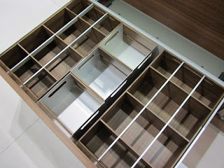
Beautiful drawer inserts!
More beautiful drawer inserts.
For more photos of the original Artesio kitchen, see a blog post I did back in 2010 here.


