Pages

August 26, 2010

Sub-Zero / Wolf, Westye F. Bakke Center

(piece by Dale Chihuly)

I just returned from an amazing trip to Fitchburg, Wisconsin, where I was fortunate to spend a few days looking in depth at the Sub-Zero and Wolf products.  These really are superior appliances, which I knew before the trip, but everything I thought before was validated by this experience.  We toured the factories for the Sub-Zero BI series and the Wolf ranges, and I was amazed at how clean these facilities were, and how meticulous the process is.  Each of these units is tested before being shipped out, and nothing but perfection will pass the inspection.

We spent the majority of our time at the Westye F. Bakke Center, and I am still in awe of the beauty of this building.  It's a breathtaking display of design and function, and a perfect way to highlight the Sub-Zero and Wolf products.   Some of the highlights:


bar designed by Jamie Drake

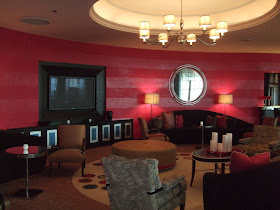
lounge designed by Jamie Drake

Entrance into the art nouveau bar, designed by Bill Draper


The woodwork is incredible, as shown by the meticulous detail of these ceiling beams.

Formal Dining Room by Bill Draper


This presentation kitchen is designed by Mick De Giulio, who I've posted about a few times.  I truly love his work.

Wine and cheese bar

More Chihuly work

Another Mick De Giulio kitchen.  Beautiful.


August 20, 2010

Living Room Color Palette

I've been so busy lately there's just been no time for posting. I'm meeting with new clients, finishing up with older clients, and right smack in the middle of working with other clients. It's crunch time for so many people - needing to get everything done before birthdays, new babies, Thanksgiving, ski season, whatever... they're all in a rush. AND I'm going to be in Madison, Wisconsin next week at the Sub-Zero / Wolf headquarters, learning everything there is to know about cooking on their products. So, life is crazy!

Rather than a big long post, I'm leaving you with a photo I absolutely love, which has now become our inspiration for our living room color palette. Grays, natural woods, and bright pops of orange and yellow. Perfect. The new grasshopper chair fabric, which is on order, will fit beautifully with this color scheme.


Have a great week everyone! I'll be better at blogging once the rush is over.
Posted by Picasa

August 16, 2010

More Backyard Progress


Slowly (very slowly), but surely, our backyard is coming together.  We've spent a couple recent weekends on the construction of a retaining wall / planter box in an area where there previously had been an ugly chain link fence lined with some plastic ribbed material, which was supposed to be doing important work like holding the neighbor's fence in place.  We pulled the chain link out and started over.   We found a bunch of inspiration photos using really modern and fun materials for retaining walls, but then realized we didn't have the budget, and it just wouldn't look good with our 1899 home.  A major backyard overhaul would be in order, and that just isn't going to happen.  We compromised by using standard cedar that matched everything else in the yard, with aluminum c-channel support posts that had been salvaged from a construction site (thanks Drew!).

Here's a quick overview of how it happened (note that I say "we" below, but Mike was most of the muscle behind all this):

1.  We measured, dug a trench, and dug the post holes.

2.  We prepared and pre-drilled the aluminum posts.

3.  We set the posts using redi-mix concrete.

4.  We installed the cedar and added some extra bracing inside the box.

5.  We filled it all in with dirt.

The yard isn't even close to being finished, but considering it used to look like this...

I'd say we're making progress, wouldn't you?

Now, anybody know anything about pruning vastly overgrown rosebushes?

August 13, 2010

Cabinet Hardware Dilemma

Our kitchen cabinets don't have any hardware.  Sometimes in kitchen planning, doors and drawers are back-beveled or routed so hardware isn't necessary, but that's not the case in this kitchen.  For a year now I've been stressing about finding the right hardware.  Here's the problem:

(our current kitchen, still without a finished tile backsplash)

As you can see, the cabinets and doors are very traditional.  Not to mention UGLY.  But replacing the cabinets (or even painting them) just isn't going to happen as soon as I'd like.  The traditional style and exposed hinges (not even sure what color to call that - dirty bronze maybe?) make it pretty much impossible to use the more streamline modern stainless pulls that we are typically drawn to.  I love modern pulls, but they'd look terrible in this kitchen.

I finally found hardware I like, that I think will look good enough in this kitchen.  These are from the Mirada collection by Jeffrey Alexander (by the way, this is a great line to look at for affordable hardware options that don't scream Home Depot).  They have softer yet modern lines, so they work with the door style, and the finish (called Bright Nickel Brushed with Dull Lacquer) actually works really well with the exposed hinges.
All the pieces are sitting in a bag on the countertop.  I have high hopes for installing them soon, though I'm guessing they'll remain in that bag for quite some time due to all the other projects to finish up on our list.


August 11, 2010

Anyone Got an Extra 15 Million?

I saw this listing for a row house on Beacon Hill in Boston and had to post some of the photos.  Each room is amazing and dramatic, but what I can't get over is how they differ from each other so much.  It's hard to imagine that each of these photos is from the same home.

This is my favorite room.  I love the pops of orange.

 Look at that ceiling!

 Hmm.... matching baby blue everywhere?  I like the fireplace though.

More orange ceilings!

Love the curbless shower look.  The kelly green glass is an interesting mix with the carrera marble floors.

Check out this beautiful bathroom!  Look closely to see the gigantic glass shower!

You know how much I love white kitchens. The range and hood are beautiful!
And the best for last.  How incredible is this infinity pool?  And the view?


August 10, 2010

Pretty Pictures from Lonny

Good Morning!  The new Lonny magazine was waiting for me in my inbox this morning, which was perfect because I got up early just so I'd have some time to enjoy catching up on reading my design blogs over a cup of coffee.  Well, instead of reading the blogs, I got to spend this time drooling over the colorful images in the magazine.  A few of my favorites are below, and you can see more at www.lonnymag.com.


August 4, 2010

Chandeliers in Kitchens


I'm loving the look of chandeliers in kitchens.  Not in the traditional way where the kitchen is so ornate and over-the-top that you expect to see an elaborate light fixture...

like this:

or this:
from Habersham

But in the untraditional unexpected way where a chandelier adds just a touch of elegance or personality or just plain fun, like the photos below:


source unknown

Gwyneth Paltrow's Kitchen


source unknown